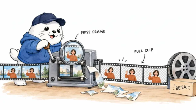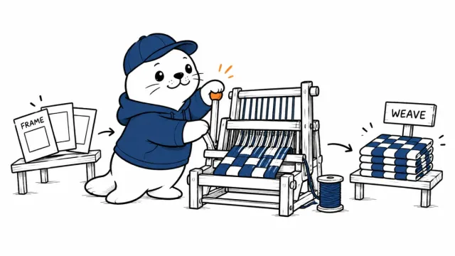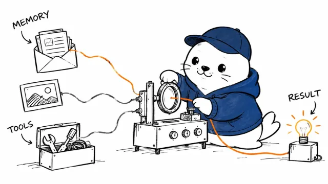

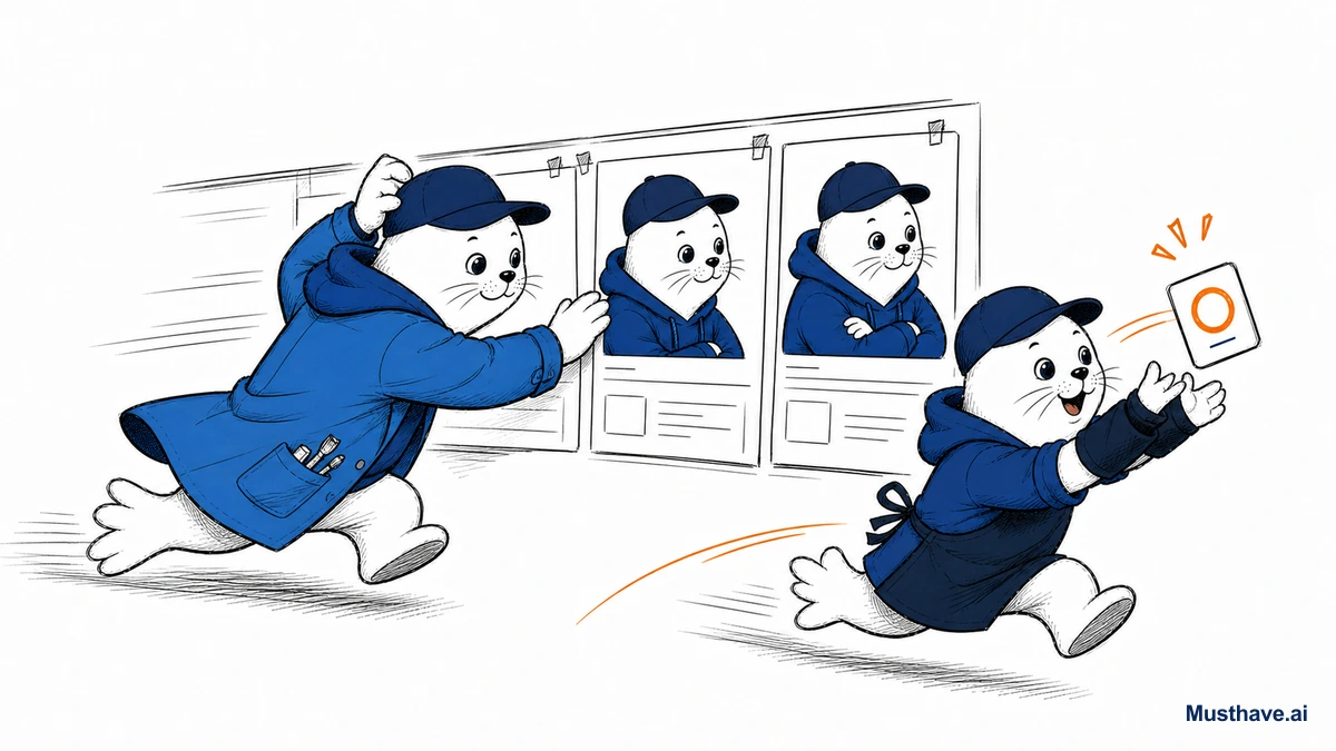
AI image tools improve so fast that last year’s advice is often wrong. But most of the 2026 progress boils down to three things sellers actually feel, readable text, consistency, and in-context editing. Here’s what changed and how to put it to work without chasing every shiny release.
The real job of AI images (still)
Before the new stuff, the anchor that never changes: an AI image only matters if it helps you publish or sell. Pretty generations that die in a Discord channel are a hobby. Assets that survive a phone screen, a print, or an ad auction are a business. Every “what’s new” below is only worth your attention if it moves that needle.
What’s new #1: text finally works
For years, the running joke was that AI image tools couldn’t spell. Ask for a poster with a headline and you’d get beautiful nonsense. That’s largely solved now, Ideogram renders embedded text at roughly 90-95% accuracy, versus the 30-40% you’d get from a pure style model. For sellers, that’s huge: legible slogans on merch, clean price callouts, real headlines on posters, all without hand-fixing every letter.
The practical takeaway: if your image needs words, use a text-capable tool (Ideogram) rather than fighting a model that was never built for it.
What’s new #2: consistency you can rely on
The other big leap is consistency. Early AI image work was a slot machine, every generation looked like a different artist made it. Now, style-reference features (upload a few images to lock a look) and better character consistency let you produce a whole batch that actually belongs together.
Why sellers care: brand work lives or dies on consistency. A product line, an ad set, a series of thumbnails, they need to feel like one coherent thing. Being able to hold a style across many images is the difference between “looks like a brand” and “looks like random AI outputs.”
What’s new #3: editing moved into the flow
The third shift is in-context editing. Instead of regenerating a whole image to change one detail, you can now edit with a prompt, tools like Nano Banana (built into Google’s Gemini and Chrome) let you tweak an image where you’re already working, and Ideogram’s canvas offers inpainting and outpainting for targeted fixes. Change a background, remove an object, extend a scene, no full re-roll required.
For anyone iterating under deadline, that’s real time saved. Editing beats regenerating.
The tools sellers actually use
Put it together and here’s the stack I’d hand a seller in 2026, small, focused, each tool doing the job it wins:
- Midjourney, art direction, mood, lifestyle and product concepts (weak at text).
- Ideogram, anything with readable text, plus its canvas for edits.
- Kittl, finishing for print: clean vectors, typography, print-ready export.
- Nano Banana / in-app editors, quick contextual tweaks without leaving your flow.
You don’t need twelve subscriptions. You need one strong style model, one text tool, and one place to finish for print.
What hasn’t changed: the standards
New capabilities don’t change the rules that keep you in business. Zoom every design to thumbnail size and read the text. Never advertise a product prettier than the one that ships, that’s a refund machine, not a growth hack. And keep your designs original and trademark-clean. The tools got dramatically better; your judgment about what’s honest and sellable is still the part that matters.
The style-reference trick for a consistent look
The most useful of the new image features for anyone building a brand is style reference, and here’s how to actually use it. Generate or choose two or three images whose look you love (the palette, the lighting, the vibe) and feed them in as references for every new image in a set. The tool locks onto that visual signature, so your product shots, thumbnails, and ad creative come out looking like one coherent brand instead of random outputs. Do it once, save your reference set, and reuse it. Consistency, not any single pretty image, is what makes AI visuals look professional.
Which of these upgrades has changed your workflow most, text, consistency, or editing? Tell me in the comments.
Verification sources and related guides
Primary reference: Ideogram official documentation. This is an official provider source. Treat performance, adoption, and product claims as company-reported unless the article identifies an independent check.