
Every AI image generator promises the world, then chokes the moment you ask for a single readable word. Ideogram is the one that doesn’t. If your work involves text on an image (a poster, a logo, a t-shirt, packaging) this is the Musthave pick, and it’s not close.
Why Ideogram earns a Musthave spot
Quick reminder on the standard: The Musthave Selection isn’t a paid shelf. A tool only lands here if I’d hand it to a busy, skeptical friend already drowning in free trials. Ideogram clears that bar by owning one job completely, text inside images.
Here’s the number that matters. Ideogram’s current 3.0 model renders embedded text at roughly 90 to 95 percent accuracy. Midjourney and most other generators land around 30 to 40 percent, which is why they hand you beautiful posters full of misspelled gibberish. If words are part of the deliverable, that gap is the entire game.
What it actually does well
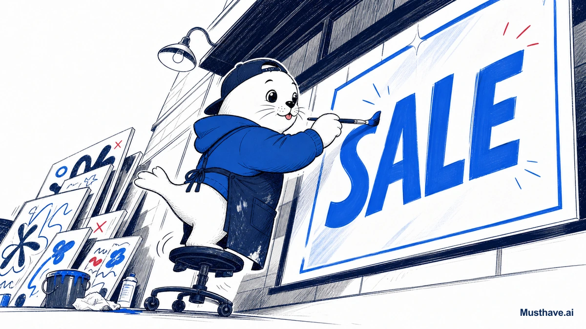
The headline feature is Magic Prompt for text. You write something like “poster that says ‘GRAND OPENING’ in bold red typography,” and you get back an image where the text is spelled correctly, styled properly, and actually composed into the layout, not floating like an afterthought.
Around that, the 3.0 model gives you real working controls: four style types (Auto, General, Realistic, and Design), three speed tiers (Turbo, Default, Quality), and resolutions from small portraits up to 1536px landscapes. Two features earn their keep for anyone doing this professionally:
- Style Reference: upload up to three reference images to lock a consistent look across a whole batch, essential for brand work.
- Canvas Editor: inpainting and outpainting for targeted fixes, so you can correct one word or extend a background without regenerating everything.
What I actually use it for
In practice, Ideogram is the tool I reach for whenever letters have to be right the first time:
- Quote graphics and social posts where the text is the design.
- Logos and wordmarks (as concepts and starting points).
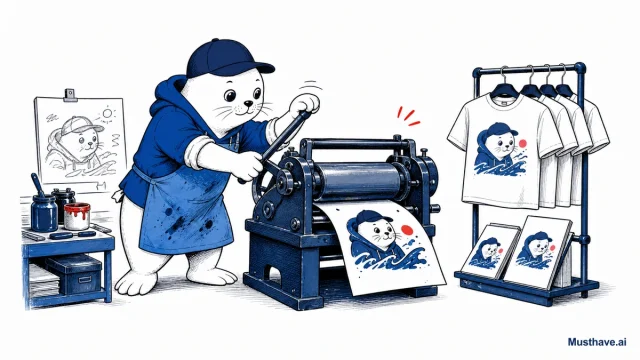
- Merch and POD designs with slogans that must be legible on fabric.
- Posters, flyers, and packaging mockups with real headlines.
Anywhere a misspelled word means a refund or a reprint, this is the safer tool.
The pricing (honest version)
Ideogram is refreshingly approachable. There’s a free tier with 10 prompts a day, genuinely enough to test it properly. Paid plans start at Basic for $7/month, Plus around $16–20 (private generation, more credits), and Pro around $42–48 (batch generation and API access). Annual billing knocks off 20 percent, and (important for sellers) every paid plan includes a full commercial license. If you want to automate at volume, the API on Pro bills per image (a few cents for Turbo, a bit more for Quality).
Where it fits in your stack
Here’s the honest boundary: Ideogram is a text specialist, not necessarily your pick for pure cinematic art direction. That’s fine, it’s not trying to be. The pro move is to pair it with Midjourney. Generate the mood, lighting, and composition in Midjourney, then bring the piece into Ideogram (or hand off the text layer to it) when words need to land cleanly.
That’s the whole Musthave philosophy again: loyalty to the outcome, not the logo. Two focused tools, each winning the job it was built for, beats one tool doing everything at 60 percent.
Who should skip it
If your images never contain text, you may not need a dedicated tool for it. And if you only make the occasional graphic, the free tier probably covers you, don’t rush to a paid plan for a badge. But if you sell with words-on-images and you’re tired of fixing garbled letters by hand, Ideogram earns its place on the short list without breaking a sweat.
The one prompt trick that fixes text
Ideogram is built for text, but you get the best results with a specific format: put the exact words in quotation marks and describe the style separately. So instead of “a coffee shop poster about a grand opening,” write: poster that says “GRAND OPENING” in bold retro serif, warm cream and brown palette, centered. Quoting the literal text tells the model precisely what to render, and naming the style keeps the typography intentional. This one habit is the difference between usable, correctly-spelled results on the first try and rerolling ten times.
What do you make that needs text baked in, merch, posters, thumbnails? Tell me your use case in the comments and I’ll share how I’d prompt it.
Verification sources and related guides
Primary reference: Ideogram official documentation. This is an official provider source. Treat performance, adoption, and product claims as company-reported unless the article identifies an independent check.